 Hyperlocal Weather
An hourly weather graph you can read like a pro
Stop tapping day by day. Hyperlocal Weather's hourly weather graph plots precipitation probability and rate, snow and thunder together — then runs continuously across days so the whole week sits in one chart. Toggle between eight metrics with a single tap. Free on iPhone & Android, worldwide.
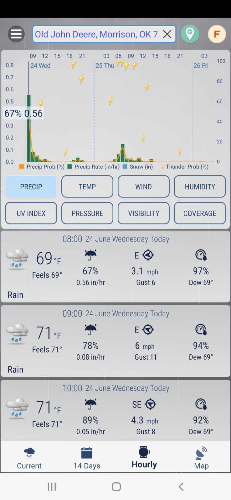
Eight metrics, one tap apart
See the whole week at once
Most apps chop the forecast into daily boxes you tap one by one. Here the hourly chart runs continuously across days, so a mid-week cold front or a Saturday wet spell shows up as a shape you spot in a second — then a 14-day list with a plain-language THIS WEEK summary fills in the rest.
- Continuous multi-day chart — no day-by-day tapping.
- 14-day outlook alongside the hour-by-hour detail.
- Plain-language week summary when you just want the gist.
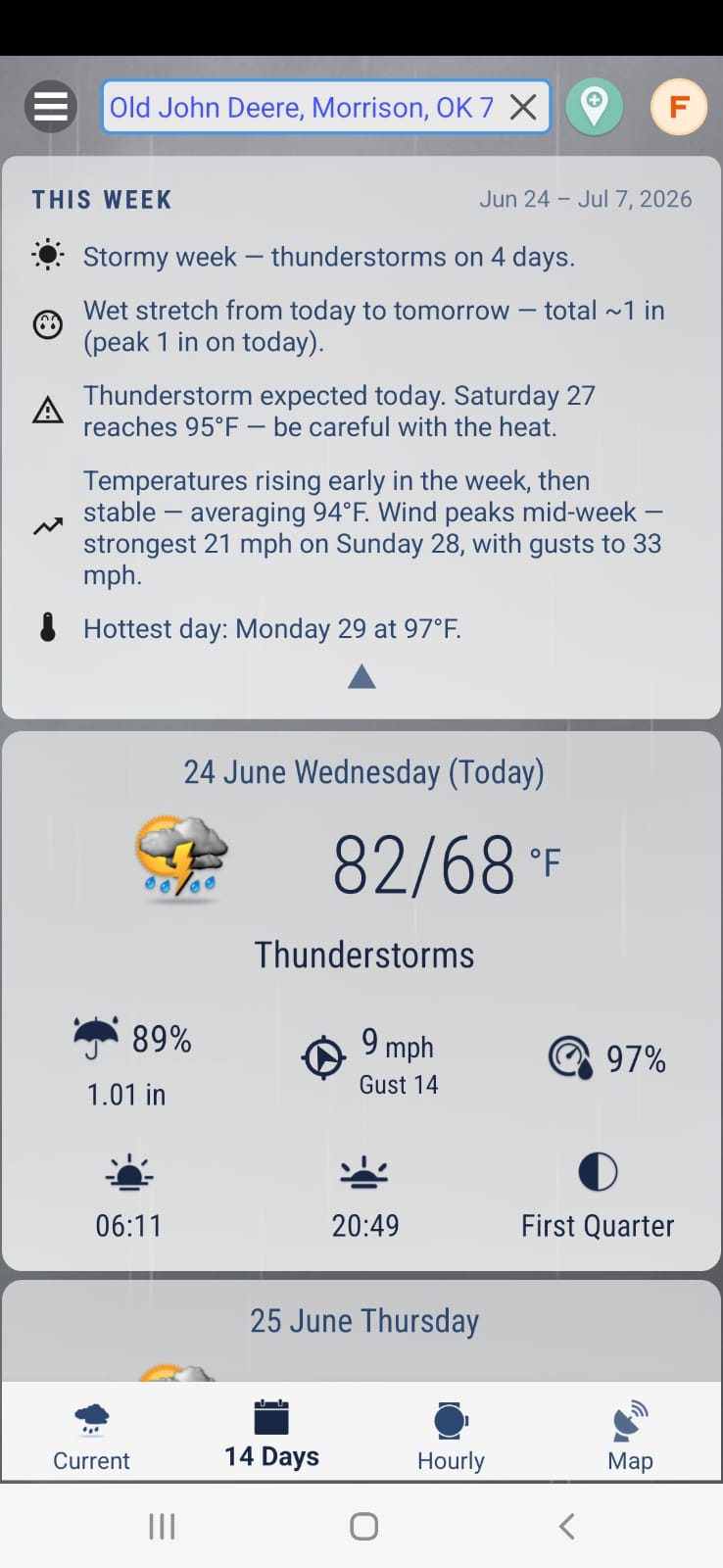
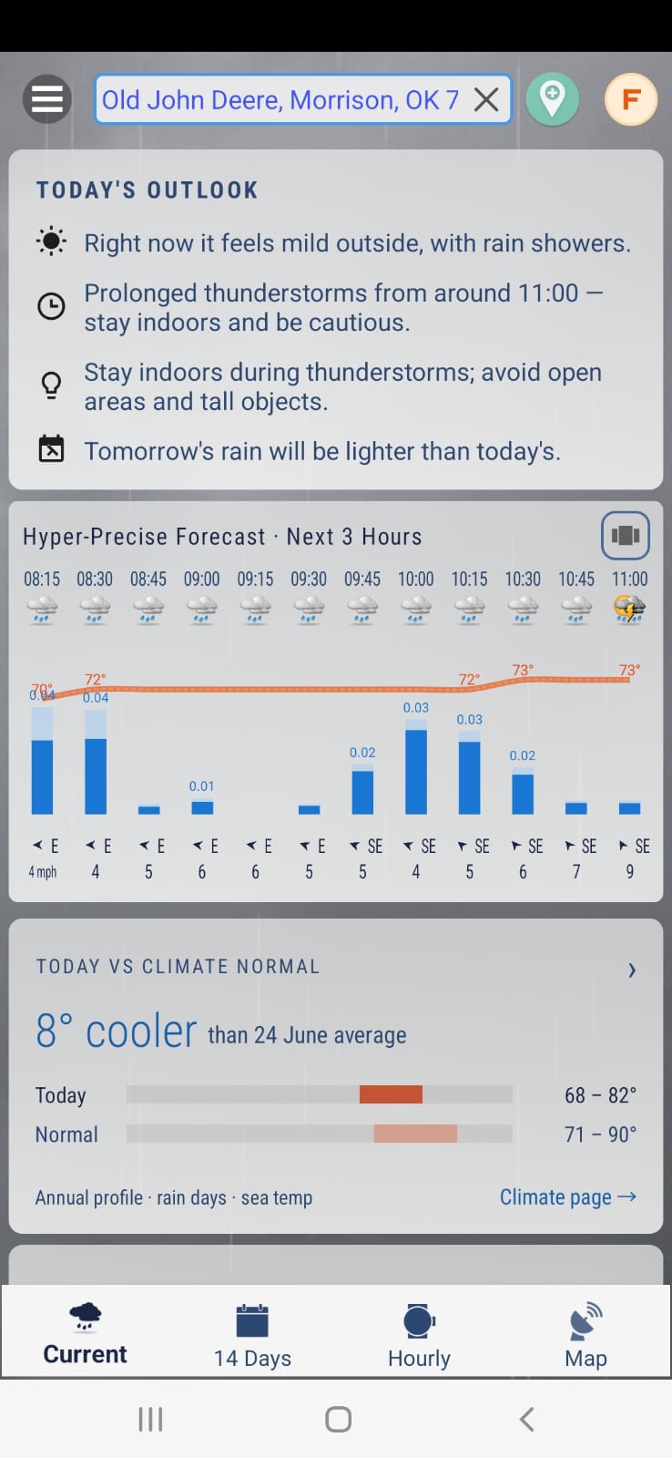
From week view down to 15-minute steps
The graph gives you the big picture; the hyper-precise view gives you the next three hours in 15-minute steps — icons, a temperature line, precipitation bars and wind arrows. Same forecast engine, two zoom levels.
- Next 3 hours broken into 15-minute intervals.
- Temp line, precip bars, wind arrows in one compact strip.
- Today vs climate normal — instantly see if today is unusual.
An hour-by-hour list with the details that matter
Charts show the pattern; the list below nails the numbers. Every hour comes with feels-like temperature, wind gusts and dew point — the three figures that decide whether a run, a ride or a job site is actually comfortable.
- Feels-like for every hour, not just the daily high.
- Wind gusts — the number that actually knocks things over.
- Dew point to judge mugginess before you head out.
What makes a good hourly weather graph?
An hourly weather graph turns hundreds of forecast numbers into a shape your eye can read instantly. A good one does three things: it plots the variables that interact — precipitation probability and precipitation rate, snow and thunder — on the same chart instead of hiding them on separate screens; it lets you switch metrics without digging through menus; and it doesn't cut the timeline into artificial daily boxes. Hyperlocal Weather's hourly forecast chart does all three, with one-tap toggles for precip, temperature, wind, humidity, UV index, pressure, visibility and cloud coverage.
A weekly weather graph, not a daily one
Because the chart runs continuously across days, it doubles as a weekly weather graph: fronts, warm spells and multi-day rain events appear as one uninterrupted line. That makes planning genuinely easier — you can pick the driest window for a bike ride or the calmest morning for a flight without opening seven separate day views. When you need to zoom right in, the 15-minute forecast resolves the next three hours in quarter-hour steps.
Hour by hour, with context
Under the graph, an hour by hour forecast list adds feels-like, wind gusts and dew point, and a comparison against climate normals tells you whether today is warmer or cooler than usual for the date. The same data drives the rest of the app, including the rainfall app features.
- Runners and cyclists pick the coolest, driest hour of the day.
- Event planners scan the whole week for the safest window.
- Photographers track cloud coverage and visibility hour by hour.
- Gardeners and growers watch precipitation rate, not just probability.
All of it is powered by Foreca, Apple WeatherKit and real weather-station observations, pinpointed to your coordinates — and it works worldwide on both iPhone and Android.
Hourly graph questions
What does the hourly weather graph show?
The chart plots precipitation probability and precipitation rate together, alongside snow and thunder probability, hour by hour. One-tap toggles switch the view to temperature, wind, humidity, UV index, pressure, visibility or cloud coverage — eight metrics in one hourly forecast chart.
Can I see the whole week in one chart?
Yes. Unlike apps that make you tap into each day separately, Hyperlocal Weather's graph runs continuously across multiple days. Scroll sideways and the line keeps going, so you can see the whole week's pattern — warm-ups, cold fronts, wet spells — at a glance.
Is there an hour-by-hour list as well as the graph?
Yes. Below the chart there is an hour-by-hour forecast list with feels-like temperature, wind gusts and dew point for every hour, so you can pair the visual pattern with exact numbers.
Which platforms and countries does the hourly graph work in?
The hourly weather graph is free on iPhone and Android (Wear OS is included with the Android app), and works worldwide — the US, Canada, the UK, Ireland, France, Germany, Japan, Singapore, Australia and more — using Foreca, Apple WeatherKit and real weather-station observations.
Related forecast tools
Put the whole week in one chart
Get Hyperlocal Weather and read the hourly graph like a pro — iPhone, Android and worldwide.